Building a dependency-free tooltip
Positioning, animation, and accessibility without Floating UI or Popper.
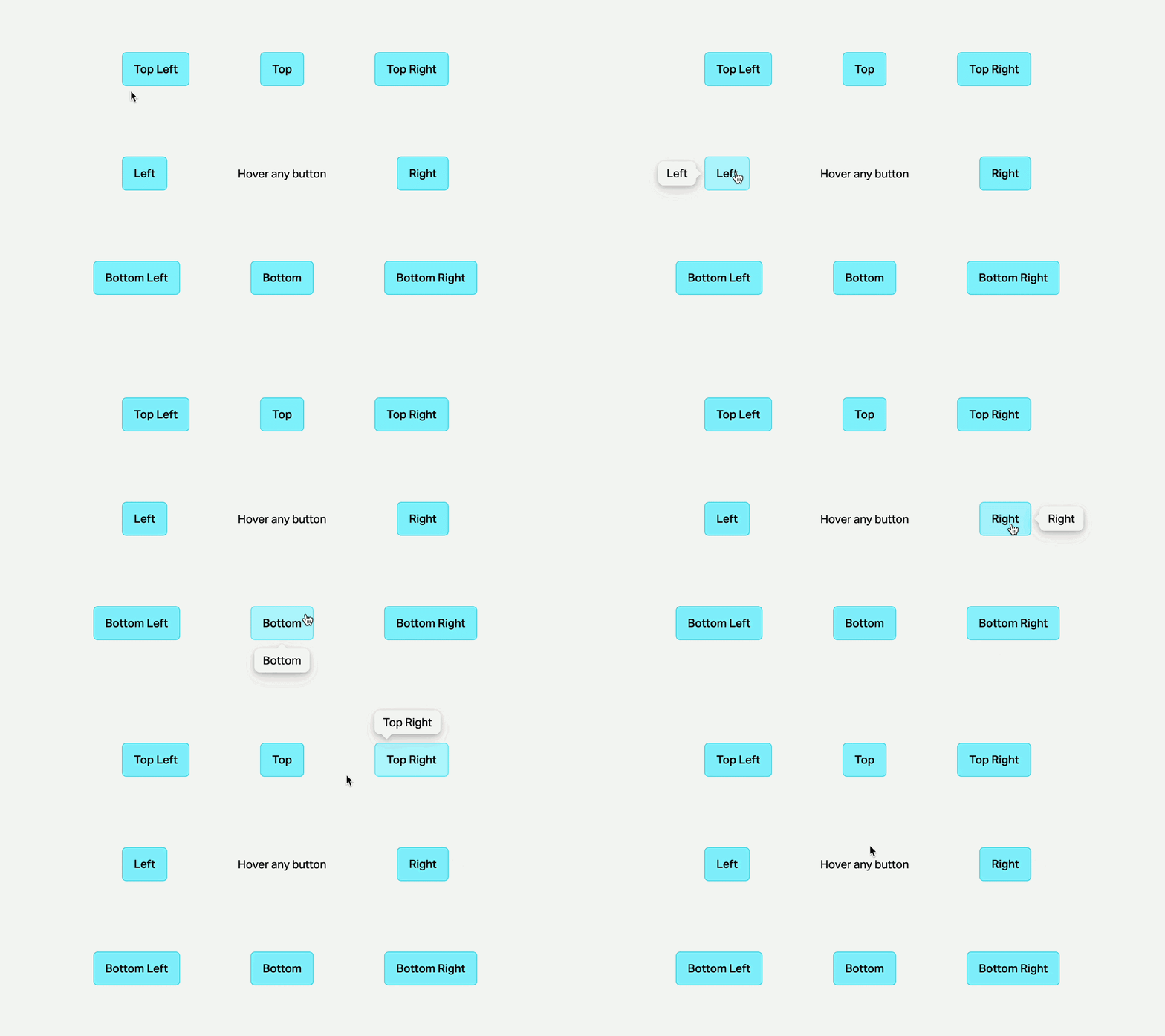
Why build without a library?
Most tooltip libraries (react-laag, Floating UI, Popper.js) handle positioning for you, but they come with tradeoffs: added bundle weight, dependency maintenance risk, and styling systems that can be hard to override. Building your own gives you full control with surprisingly little code.
1. Trigger wrapper
Wrap the trigger in a container and attach mouse and focus handlers. onFocus / onBlur are required for keyboard accessibility — hover-only tooltips exclude keyboard users entirely.
<div
  ref={triggerRef}
  style={{ display: "inline-flex" }}
  onMouseEnter={showTooltip}
  onMouseLeave={hideTooltip}
  onFocus={showTooltip}
  onBlur={hideTooltip}
>
  {children}
</div>
2. Portal
Mount the tooltip bubble into document.body using a React portal.
import { createPortal } from "react-dom";

const Portal = ({ children }) => {
  const [mountNode, setMountNode] = useState(null);

  useEffect(() => setMountNode(document.body), []);

  if (!mountNode) return null;
  return createPortal(children, mountNode);
};
If the tooltip stays inside the trigger’s DOM subtree it can be:
- Clipped by
overflow: hiddenon any ancestor - Obscured by a lower z-index stacking context
- Mispositioned if an ancestor has
transform,filter, orwill-change
Portaling to body escapes all of these constraints, regardless of where the trigger lives on the page.
3. Positioning
Read the trigger’s position with getBoundingClientRect() and apply it as position: fixed. Use CSS transform with percentage units to center the tooltip — you never need to measure the tooltip’s own dimensions.
const rect = triggerRef.current.getBoundingClientRect();

// top
{
  position: "fixed",
  top: rect.top - offset,
  left: rect.left + rect.width / 2,
  transform: "translateX(-50%) translateY(-100%)",
}

// bottom
{
  position: "fixed",
  top: rect.bottom + offset,
  left: rect.left + rect.width / 2,
  transform: "translateX(-50%)",
}

// left
{
  position: "fixed",
  top: rect.top + rect.height / 2,
  left: rect.left - offset,
  transform: "translateX(-100%) translateY(-50%)",
}

// right
{
  position: "fixed",
  top: rect.top + rect.height / 2,
  left: rect.right + offset,
  transform: "translateY(-50%)",
}
Keep the position updated on scroll and resize:
useEffect(() => {
  if (!isVisible) return;

  const update = () => {
    setRect(triggerRef.current.getBoundingClientRect());
  };

  window.addEventListener("scroll", update, true);
  window.addEventListener("resize", update);

  return () => {
    window.removeEventListener("scroll", update, true);
    window.removeEventListener("resize", update);
  };
}, [isVisible]);
4. Preventing pop-in with requestAnimationFrame
A double RAF defers visibility until the browser has had two full frames to settle. A single RAF fires before the next paint — the DOM update from setRect may not yet be reflected in layout. The second RAF guarantees the browser has had one complete opportunity to process it.
const showTooltip = () => {
  setRect(triggerRef.current.getBoundingClientRect());

  requestAnimationFrame(() => {
    requestAnimationFrame(() => {
      setIsVisible(true);
    });
  });
};
5. Show and hide
Do not conditionally render the tooltip with {isVisible && <Tooltip />} — no exit animation is possible. Render it once and toggle visibility with CSS. visibility: hidden is needed alongside opacity: 0 because an opacity-0 element still intercepts pointer events.
opacity: isVisible ? 1 : 0,
visibility: isVisible ? "visible" : "hidden",
transition: "opacity 150ms, transform 150ms, visibility 150ms cubic-bezier(.4, 0, .2, 1)",
pointerEvents: "none",
6. Animation
The tooltip slides toward the trigger as it fades out, and away from it as it fades in — no separate keyframes needed.
const slideOffset = isVisible ? 0 : -8;
const scale = isVisible ? "scale(1)" : "scale(0.95)";

// top
transform: `translateX(-50%) translateY(calc(-100% - ${slideOffset}px)) ${scale}`

// bottom
transform: `translateX(-50%) translateY(${slideOffset}px) ${scale}`
7. Enter and leave delays
Cancel the opposite timer so rapid hover does not flicker. Also cancel any pending RAF on hide.
const showTooltip = () => {
  if (leaveTimeout.current) clearTimeout(leaveTimeout.current);
  enterTimeout.current = setTimeout(() => setIsVisible(true), delayEnter);
};

const hideTooltip = () => {
  if (enterTimeout.current) clearTimeout(enterTimeout.current);
  if (rafRef.current) cancelAnimationFrame(rafRef.current);
  leaveTimeout.current = setTimeout(() => setIsVisible(false), delayLeave);
};
8. The arrow
Apply shadow on the container using filter: drop-shadow, not box-shadow. box-shadow does not follow the rotated arrow shape.
{
  position: "absolute",
  width: 10,
  height: 10,
  transform: "rotate(45deg)",
  borderRadius: 1,
  backgroundColor: "<tooltip-bg>",
  bottom: -5,
  left: "50%",
  marginLeft: -5,
}

filter: "drop-shadow(0 6px 10px rgba(0,0,0,0.1)) drop-shadow(0 2px 3px rgba(0,0,0,0.2))"
9. Accessibility
| Requirement | Implementation |
|---|---|
| Screen reader association | aria-describedby on the trigger, matching id on the tooltip (only when visible) |
| Role | role="tooltip" on the bubble |
| Hidden state | aria-hidden="true" when not visible |
| Keyboard dismiss | Escape keydown listener on document |
| Keyboard trigger | onFocus / onBlur on the wrapper |
Summary
| Decision | Why |
|---|---|
| No positioning library | No extra dependency to maintain |
| Portal to document.body | Escapes overflow and stacking-context issues |
| position: fixed + CSS transforms | No need to measure the tooltip |
| Double RAF before showing | Prevents pop-in at the wrong position |
| Keep in DOM, use opacity/visibility | Exit animation always works |
| filter: drop-shadow on container | Shadow follows the arrow shape |